New Star Trek posters are not logical Jim!
 Fri, March 27, 2009
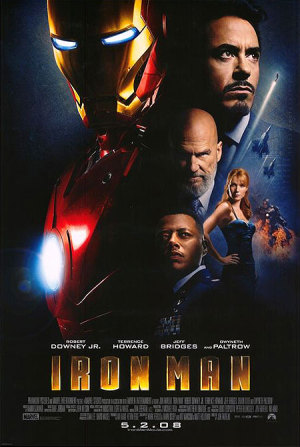
 Hey folks, shall we play a little game of spot the difference. Okey dokey then. Ready, set........GO:


Hmmmmmmm....
There are much bigger concerns in the world right now than how the art of the modern movie poster is dying, replaced by the menace of 'the floating head' but I think Paramount may have crossed the line this time by directly ripping off a poster to one of their own blockbusters from only last year (unless it's just me that thinks this and I'm crazily seeing things that aren't there).
Aside from that, notice the wording directly below the title on the 'Star Trek' poster; 'The Future Begins'. Is this the new subtitle for the film? Apparently, this is one of the UK posters for the film so it might simply be a European exclusive subtitle. We know that 'The Future Begins' was the subtitle of the subtitle of 'Terminator: Salvation' for a while before it got dropped. Have Paramount stolen that as well? Does 'Star Trek' need a subtitle?
Even though I think the answer is 'no', I'd love to hear your thoughts. I'm really rather disappointed at Paramount right now.
A shout out to 'MovieWeb' which have some more brand new Trek posters right here.

Reader Comments (1)
I wouldn't call it ripping off, but probably using the same graphic artists,, possibly those with contracts with Paramount. However, the better of the two is Iron Man, because it is the better contrast and more eye catching.One thing I noticed about Trek: and it's an interesting surprise....in most OS Trek films it is usually like this:
Kirk
Sock
Dr McCoy
Sometimes you;ll get a Klingon, Khan or some guest alien.
Does UHURA have a beefed up role in the film? Zoe's likeness is the third largest head, and more less obscured.